

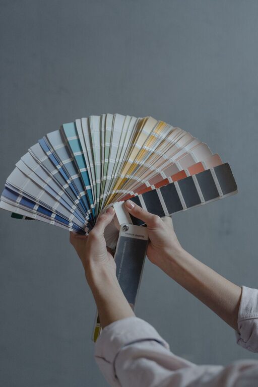
Creating a calm and inviting atmosphere in your home starts with the colors you choose. Calm colors can help reduce stress, promote relaxation, and make your space feel more comfortable and welcoming. Whether you are repainting a single room or redesigning your entire home, selecting the right hues plays a key role in setting the mood.
In this post, we’ll explore practical tips for choosing calm colors that work well together and suit your personal style. You’ll also find ideas on how to use these colors effectively throughout your home.
Why Choose Calm Colors?
Calm colors are typically soft, muted, and gentle tones that evoke feelings of peace and tranquility. They can be cool shades like blues and greens or warm neutrals like soft beiges and grays. Using calm colors can:
– Promote relaxation and reduce anxiety
– Make rooms feel more spacious and airy
– Serve as a soothing backdrop for furniture and decor
– Help you unwind after a busy day
Tips for Choosing Calm Colors
1. Consider the Room’s Purpose
The best calm color for a room often depends on how you use the space:
– Bedroom: Soft blues, lavenders, or pale greens encourage rest and sleep.
– Living Room: Warm neutrals or gentle greens make a welcoming environment.
– Bathroom: Light blues and seafoam greens offer a fresh, spa-like feel.
– Home Office: Subtle grays or mint tones can promote focus while remaining calming.
Think about what mood you want each room to have and choose colors accordingly.
2. Start with Neutral Bases
Neutral colors like beige, cream, taupe, or light gray form a perfect base for calm interiors. These hues are easy to match with other shades and won’t overwhelm your senses.
Using a neutral base allows you flexibility to add accent colors or textured fabrics without clashing. Plus, neutrals tend to stand the test of time and keep rooms feeling fresh longer.
3. Use Soft Blues and Greens
Blue and green tones are naturally soothing because they remind us of nature—the sky, water, and plants. Soft, muted blues and greens can create a serene atmosphere in any room.
If you want a gentle accent, consider pastel blues like powder blue or muted sage green. For walls, choose light versions with a matte finish to avoid glare.
4. Incorporate Warm, Muted Colors
Calm doesn’t always mean cool. Warm, muted colors like dusty rose, soft peach, or warm gray can add coziness without feeling too bold.
These colors work especially well in living spaces and bedrooms where comfort is key. When combined with natural materials such as wood and linen, they enhance a calming vibe.
5. Test Paint Samples in Different Lighting
Colors can look very different depending on lighting. Always test paint samples on your walls and observe them at various times of day.
– Morning light is cooler and brighter.
– Afternoon sunlight is warmer and intense.
– Evenings usually have softer, dimmer light.
By checking your colors in all lighting conditions, you can be confident they will maintain a calm look throughout the day.
6. Limit Bright and Bold Colors
While pops of bright color can add interest, too many bright or saturated tones can interrupt a calm setting. If you love vibrant hues, use them sparingly in accessories like throw pillows, artwork, or rugs.
Keeping the majority of your palette soft and muted lets your home feel peaceful without being boring.
7. Consider Matte or Satin Finishes
Finish matters when it comes to paint. Matte and satin finishes diffuse light gently, which helps colors feel softer and less reflective.
Glossy or high-sheen finishes can create glare, making colors appear harsher. For calm interiors, lean toward flat to satin paints for walls.
8. Coordinate Colors Across Spaces
For a harmonious home environment, coordinate your calm colors throughout rooms and hallways. Choose a consistent palette of two to three main colors and repeat them in different ways.
This helps create a smooth flow between spaces and prevents sudden shifts in mood.
Popular Calm Color Palettes to Try
Here are some soothing color combinations you might like:
– Soft Blue + Warm Beige + White
– Sage Green + Light Gray + Cream
– Pale Lavender + Soft Taupe + Dusty Rose
– Muted Peach + Warm Gray + Off-White
– Seafoam Green + Pale Sand + Soft Blue
Feel free to personalize by adjusting shades or introducing subtle patterns.
Additional Ways to Enhance Calmness with Color
– Use natural materials: Wood, stone, and linen textures complement calm colors and add warmth.
– Bring in plants: Greenery enhances the relaxing effect of soothing hues.
– Balance with light: Maximize natural light and use soft lighting fixtures.
– Keep decor minimal: Clutter can overwhelm calm spaces, so choose simple, purposeful furnishings.
Final Thoughts
Choosing calm colors for your home is a wonderful step toward creating a peaceful retreat. By understanding the moods different shades inspire and selecting your palette carefully, you can transform any space into a soothing haven.
Take your time exploring paint samples, consider the function of each room, and trust your instincts. With these tips, you’ll be well on your way to enjoying a home filled with calm and comfort.